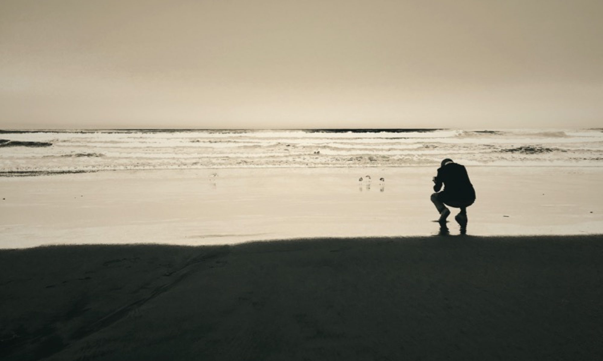
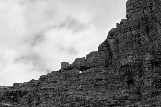
The photograph above is one of my favorites from this summer’s mountain series; the one below, although it does not quite stand on its own as a single image, goes along nicely (at this size the gist of both of them is somewhat lost compared to looking at the prints, but that’s what everybody is wrestling with when it comes to fairly detailed images on the web).
Here’s a very simple exposure strategy that took me some time to figure out, and you may want to try it too: First, taking the picture, always check the histogram on the back of the camera. Expose “to the right” (so that the histogram almost touches the right border of the screen, but not quite, to avoid blown highlights). When, like with this subject matter, a lot of cloudy sky is involved, *leave a little room*, so that the sky (almost always the brightest part of the image) will not extend beyond a brightness level of about 220-240 in Photoshop. If you are somewhat familiar with Photoshop, it will only take little experience to judge the right amount even from the tiny histogram on the camera screen, and if you expose like this consistently, post processing will be a breeze. In Photoshop, select the sky, feather the selection the tiniest bit (between 1 and 3 pixels), expand it by the same amount (1-3 pixels), then inverse the selection. From now on, leave the sky alone. Expand the contrast/brightness range of the mountain until it covers all 255 levels, via a simple auto contrast and/or level adjustment. That way, the dark parts of your image won’t look flat or muddy (of course, these things are best done on an extra layer). To finish it off, deselect, flatten the image, and do a simple auto levels adjustment – if you have done everything right, that will change almost nothing, it’s more like a consistency test. Personally, I keep 99 percent of the exposure of any image between levels 12 and 240, so that even on average screens (and your work will be looked at on average screens most of the time) neither shadows nor highlights will look blocked.
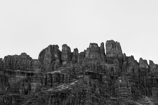
My own workflow is a little more complex, with a raw conversion via Adobe Lightroom and some contrast adjustment there. And once the image is imported into Photoshop, I create and merge layers dozens of times, changing contrast in the highlights, midtones and shadows separately, with some soft/hard light filtering applied to layers as well. But all that does not make much of a difference to the basic concept of putting the brightest details into the darker areas of the image – in other words, kind of an Ansel Adams zone system applied not just to the entire image, but to separate parts of an image repeatedly. With experience, this way post processing will be quite straightforward, and you’ll be safe from a lot of grief with overexposed clouds and muddy shadows.