It’s Good To Hear That We Shall Finally Speak In Person

“Dear Dr. Hare,

Marian just called to update my address and all. I’m intrigued that going to your office from my new place at Central Park West will now literally be a walk through the park – and a nice part of the park at that, with barely any tourists. I’ve confirmed our next appointment for Thursday [this] week.
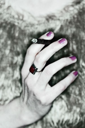
Copyright 2008 Jens Haas - www.jenshaas.com

This is a time of change for me. If it weren’t totally out of question, I’d love to invite you to see the new apartment. Doesn’t the place one lives in say so much about one’s personality? But I know, this is not appropriate (though I hate that word). I have to report that my arm may not fully heal, but it’s alright, it’s good enough already, and still getting better.

I’m back to work. Right now, I’m putting the final touches on my book, my most autobiographic yet, which I am quite excited about. And here’s a confession: I am putting in anonymous quotes from our correspondence. Appropriate? No? Oh dear! I assume that many people are not going to understand it. But I see that as a plus. It means that you cannot really object. Or can you? I think it makes the book better, it helps the images speak.

Here’s another question that I want to talk about with you. My blog, which you kind of initiated, has gained an astonishing number of readers. I’ll admit that this makes me very happy. Especially since I’ve enthusiastically done everything wrong right from the start, thinking that, what the heck, what counts most is that *I* like it. So the idea is to share this platform with a few more like-minded people, creative minds, liberated from the confines of their daily grind in creative, academic, or corporate positions, and whatnot.

I’m much looking forward to our meeting next week, and to hearing what you think.

Take care, Jens”

“Jens,

it’s good to hear that we shall finally speak in person. I am much disturbed by your laissez-faire-attitude regarding your arm. This is you – your body, your person! You ought to care. Please promise that you will do everything to get better.

You are right, I cannot come to your apartment. As concerns your book, it may be best if we both pretended that you never mentioned this plan. You shall have to do what you shall have to do as an artist, and I will try not to be self-conscious in our correspondence (or, for that matter, resentful: am I a source of creative material for you, or a person whose ideas you value? – but I shall put this aside; if I were to go into the question of whether you can use confidential therapeutic correspondence in your art, I don’t know where this would lead us.)

On to more constructive matters. It sure is a very good plan to invite like-minded creatives to contribute to your blog. All these years, you kept telling me that photography simply is a harsh life, without a home, and without a stable circle of people to relate to. And I know that, as hard as this is, this feeds into your work in good ways. But still, perhaps your guest-writers can help you change this a little?

But more than anything, do not cancel again. It is important to come to your sessions and speak in person.

Sincerely,
Dr. Hare”
What Typewriter Do You Use – Part 17

(I’m painfully aware that Notes From Nowhere has been lacking in insulting posts lately, and promise that this will change again once I’m finished with catching up on work that I couldn’t do because of my broken arm. With that in mind, here’s a mini software review:)

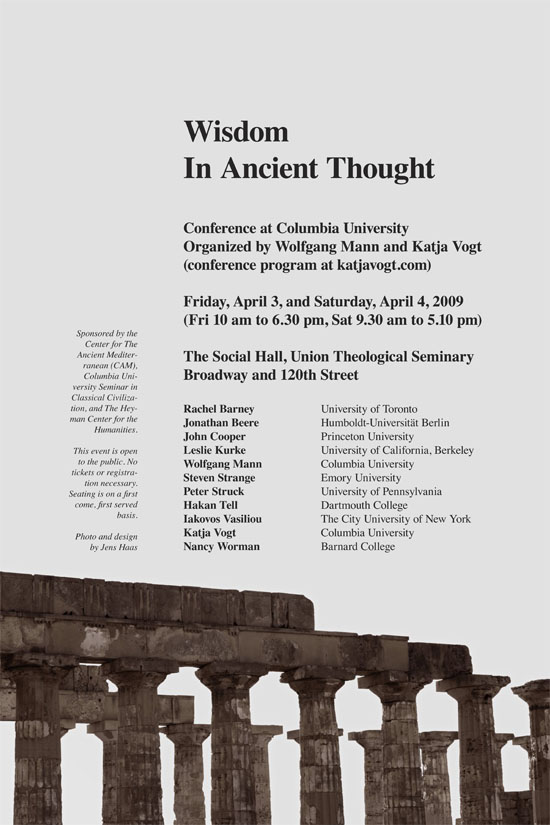
I guess I’m one of those living by the rule of making “things as simple as possible, but not simpler.” Which can be awfully difficult. This past week I had three things to design (a small photography booklet, a conference poster, and my own upcoming book of 160 pages – mostly photography, and some text), and felt like taking the opportunity and try new software.

Copyright 2009 Jens Haas - www.jenshaas.com

To make these kinds of things, I mostly use Adobe InDesign. For an Adobe application, and especially for one that is so widely used in the publishing industry, InDesign is still relatively mean and lean, which I like. But I always like leaner and meaner, and that’s why I gave Apple Pages 09 a try, and made the poster and the booklet in parallel, twice, with both applications.

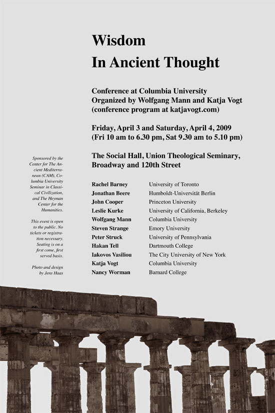
Apple Pages is very nice and slick (sans the design templates, which seem awfully cheesy to me), and simple – but too simple for some things. Pages gets amazingly close to some of the things you can do with InDesign. For the target audience – prosumers who occasionally do some small scale publishing from their home – it may be the best there is. The two posters look quite similar; the first one is the Adobe version, the second one from Pages. The InDesign default typesetting needed very little work, while the Pages version still looks a little off even after I took care of some of the glitches; nothing you can’t fix with some further work, though.

Copyright 2009 Jens Haas - www.jenshaas.com

For me, the deal breaker is that Pages lacks control over how you export your files for the printer. You can save a Pages document as a PDF/X file, although it is not immediately clear which iteration. The shop that printed the poster asked for a PDF/X-1a file. A quick round trip to Acrobat Professional and it turns out one can’t do that with Pages. So, back to InDesign. For everything that I’m going to print at home, though, I will consider Pages – it’s nice and fresh and simple.

Oh, and I am aware that this comparison is somewhat “unfair.” I do use a lot of “prosumer” gear when it comes to cameras – not because it is cheaper, but because at times it suits perfectly what I want to do, and how I want to do it. And some of the best software applications I have are basically free (WordPress, NeoOffice, Firefox and its web developer plugins, LaTex, Skype, etc.). I can appreciate a Mercedes Benz, but not for everything!

Born To Ride II

Copyright 2009 Jens Haas - www.jenshaas.com

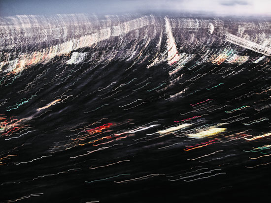
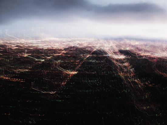
I avoid keeping similar images like the plague – in this case, however, I see the point for both. The effort with two similar images is exponentially bigger during post processing: It seems silly (at least to me) to let similar subjects like these wander too far off into different directions as to color hues and contrast – that would certainly destroy the illusion that what is in the photograph really looked that way… Below is an image of the same subject from about 30 seconds earlier (landing at LAX during a thunderstorm).

Copyright 2009 Jens Haas - www.jenshaas.com