I have worked with some pretty well known designers and many of them have surprisingly feeble websites, because they never find the time to take care of them (maybe it is a good idea to avoid designers with extremely elaborate sites – they simply may have too much time on their hands…). Anyway, it somehow feels wrong to put much effort into such stuff when it is about yourself. On the other hand, what can you do when your site ages to a point that feels embarrassing. So, last night, I re-designed mine. It’s only half way done (I still use popup windows because the code of the various “ibox” variants floating around on the web doesn’t work with all browsers). The rest has to wait until next winter (or a very rainy summer day).
What Typewriter Do You Use-Part 9
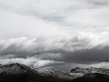
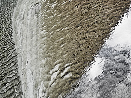
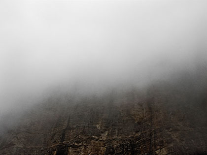
I like these three for a reason that may sound wrong – technology. I took them with a cheap digicam last summer. If there is one area where digital compacts don’t work at this point, it is certainly landscape: The files cannot resolve remote, small details. But that is not the worst part – I have seen a number of excellent landscape images where the lack of detail does not matter at all (this from someone who, admittedly, finds the current large format craze increasingly uninspired). It is the digital mess of remote, small details that makes the files, at least at this point, so painful to work with – the artifacts are just plain ugly.
While I had these three images on my hard drive for a couple of months without touching them, software has been catching up a lot. Noise removal in the latest Photoshop version has become very efficient, and there are plugins that will do the rest (no secrets here, only the usual suspects: Noise Ninja, Alien Skin BlowUp, and the likes). Now, technically it still does not make a lot of sense to do landscape photography with any of the current digital compacts. But give it two or three more years, and you’ll be able to get very good gallery prints from these kinds of devices, without as much post processing effort as you have to put into them now.
Manhattan Art 2: The Sign, By Mara L.
I thought I had been running away from European intellectualism, to New York City, the place of bluntness, where people still talk of pictures rather than ‘signs,’ canvas rather than the ‘heterogeneous materials of the medium,’ and so on. But in my lovely nightlife, cruising the New York art world, I encounter a rather strong current of Francophile (and hence Euro-phile) art talk. I guess I shall probably have to run to China next. French philosophy – the kind of thought that involves more technical terminology than anything else I’m aware of, including quantum mechanics, and that still gives itself the air of being deeply humane – has reached these shores.
Part of this trend, it seems, is a dismissive attitude towards modernity. For the uninitiated, it may be noted that the relevant philosophies presumably have uncovered the dangers of believing in science, knowledge, or progress of any sort. Modernity, of course, is culpable of naïve optimism of the suspect kind. All of this, and much more, is discussed in such convoluted terms that it seems inconceivable to me that anyone would want to read it.
Anyway, I was quite depressed last night, when I realized that said judgment about modernity extends to Pop Art, apparently now viewed as a simple-minded happy affirmation of clear lines and straight strokes (as in “naïve belief in order and knowledge”). Has everyone forgotten about the fun in art?