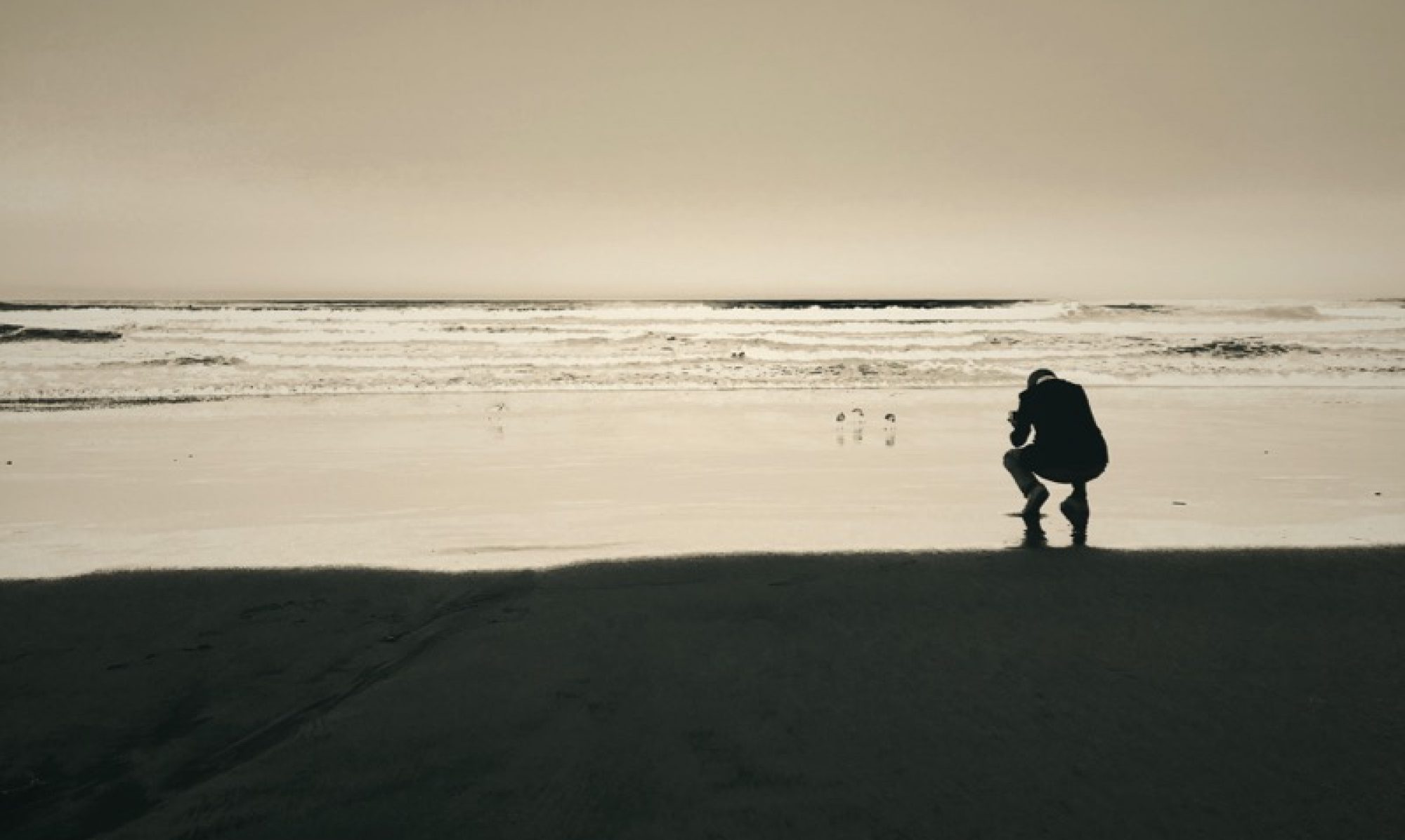
I’m using this Friday morning to put together cover drafts for the upcoming book. These are wrap-around, one-piece versions of the cover; the book spine will go right through the middle. The first version (above) is a local favorite, but I wonder whether it is a little too upbeat and “un-urban” to really stand for the whole book (you can look at an advanced edit via this link; the final book has some more recent images in it, and I’ve also dropped a few, but the overall impression has not changed that much).

The second cover option signifies well what I do. I like it. However, the “Manhattan Project” is not really the main part of the book, so this may not be the best choice for what is basically a visual autobiography of the past ten years of my life. I’m undecided, but overall this may well be it. Option two suffers most from being a low res web copy; the printed cover is 17 inches wide (the book is 8.5 by 8.5 inches), and at that size there’d be an abundance of detail.

The third one has the visual impact going for it, and the fact that traffic cones loom large in my work… On the other hand, I just did a traffic cone book. So I wonder whether there is room for another traffic cone cover?
Shoot me an email if you have an opinion on this, or comment below (email address will not appear, and will never be shared). In any case – thanks for looking!
(Update: New cover here.)