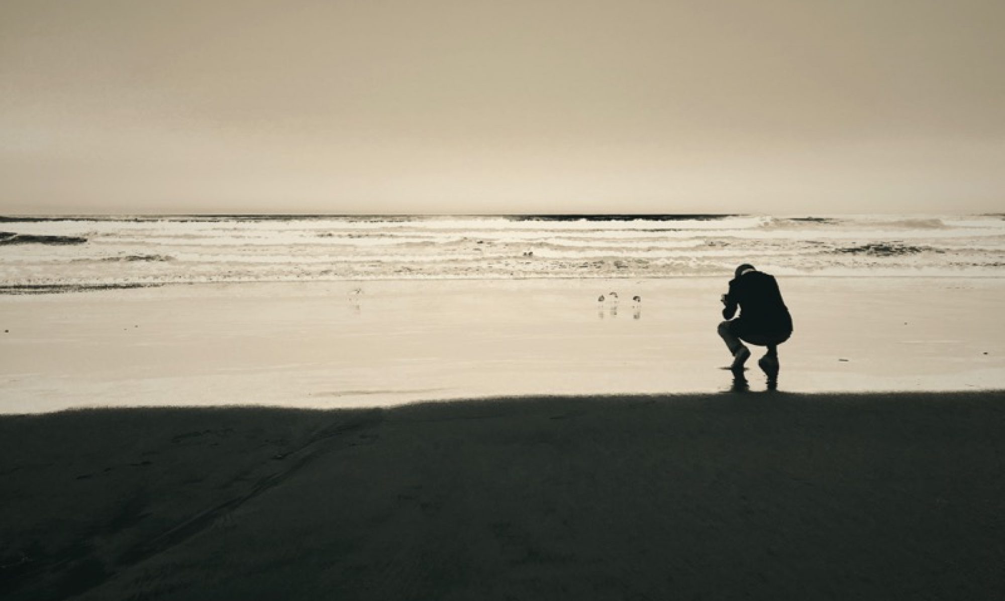
This entry is somewhat specific and very boring for most. But I do get a lot of email regarding the technical side of my work, so here we go. If you don’t know what a “raw conversion” is–consider yourself blessed, and don’t read this. If you do know, but happen to be mentally extremely stable and want to try out the main raw converters all by yourself, go ahead (and don’t read on…). But if you do have to convert your digital raw files into something that looks nice enough for that solo show in the MoMA, and don’t want to waste an entire week in front of your computer comparing raw converters, this is my brief summary on this particular issue:
Basically, the better digital cameras all offer a Raw format option. A raw file is the best starting point for a high quality, large format print simply because, compared to JPG, the raw file gives you some latitude for improving the color and contrast of the image without quality loss (think “digital negative”). If you’re interested in working from raw files, it’s usually a good idea to start with the raw conversion software of your camera brand. In my case that is mostly Canon, so Canon “Digital Photo Professional” (DPP) it is. To find out what I’m missing, I did test Canon’s DPP against Apple’s Aperture, Adobe’s Lightroom, and LightCraft’s LightZone.
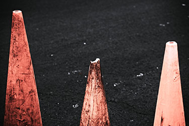
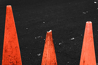
Since none of these four applications, at this point, provides all the necessary options to achieve the file quality that I want, my personal workflow requires a raw converter that leaves as little work as possible for Photoshop. I do expect this to change at some point, and Photoshop becoming mostly obsolete *for what I do*. Hence I am interested in picking the raw converter that gives me best file quality now, but also has the most promise to replace Photoshop in the future. I tested many files, the ones you see here are just two (Canon cameras at times have a problem with reds; some converters fail with very dark, high ISO images; and neutral greys can be a problem too. Hence the image of three traffic cones at night was amongst my test files).
I like refined interfaces, and in that regard Aperture is very attractive. But at this point the OS X raw engine (which Aperture relies on) has an odd rendering bug that slightly changes the pixel dimensions of all my Canon raw files. How this can go unnoticed in a 1.5.2 version is beyond me, especially with a CEO as demanding as Steve Jobs. And there are some digital artifacts in some conversions, especially in highlight areas–not good. So, Aperture at this point is not for me. On to LightZone (version 2.1): This is a very interesting application, from another company at Palo Alto (albeit a much smaller one than Apple). LightZone is very intuitive to work with for people who know the Ansel Adams zone system and find Photoshop daunting. Well, I am someone who likes, if necessary, to dig down to the last pixel, so LightZone was not for me either. But their approach is quite unique (at this point it is almost the only raw converter that allows you to edit “regions”) and I would suspect that either Adobe or Apple will buy them very soon.
That left Canon DPP and Lightroom. DPP is at version 2.2, Lightroom just made it to version 1.0. DPP is of course very well attuned to the Canon files. Colors are usually excellent with little fuss. Once you know DPP well, it will save you a lot of time. The look of the digital shadow noise in dark high ISO files is just beautiful, not unlike a very refined kind of film grain (like Kodachrome 200). And the black and white conversions are outstanding–when it comes to black and white, there is often very little work left in Photoshop for me. Probably the biggest downside of DPP: There is zero latitude in the highlights. Also, an image with tricky colors can leave you with a lot of work in Photoshop, especially regarding red hues.
Adobe Lightroom made quite a leap from the feeble public betas of last year. The community already seems to be huge, and lively. Somehow one gets the impression that no later than at version 2.0, this thing will be the 800 pound gorilla of raw conversion. I like the interface best of all four applications tested, very slick, economic, and quite unobtrusive (some seem to hate it though). Control over colors is excellent, control over contrast (especially mid tones and regional contrast) at this point is lacking though. As to black and white conversions and Lightroom: At times I could not get them anywhere near to what I get from DPP, even if I tried ten times harder. And Lightroom lumps digital noise of high ISO files into something that does not look good to me, especially in the shadows. But that is only in comparison to DPP, which again excels in this regard.
Bottom line: For black and white, it’s DPP only for me at this point. For color, Lightroom is my first choice. I admit that I *want* to like Lightroom because I think it’s going to have a lot of legs. I also really like both the interface and the open architecture of this application. Still, DPP is not only excellent for black and white conversions but for color too–in that regard, I think one has to make a case by case decision between Lightroom and DPP. There’ll be a new version of DPP in April, and Lightroom will probably make it’s next leap not too long after that. Oh, the traffic cone images: The lighter version comes from DPP and required quite a bit of retouching in Photoshop. The end result is a little “off”, but I think in a refined way. I like it. The other, more saturated one, comes from Lightroom and only needed a fairly reasonable amount of Photoshop. In this case it’s the one I’ll keep.